The UI system in SS14 has been through several iterations, and many portions of
the codebase are out-of-date with the current UI conventions. When using
existing UIs as reference, please keep the age of the code in mind.If you find some code that is not up to the current conventions, refactors are
always appreciated!
Okay, but how do I make it fancy?
FancyWindow
DefaultWindow is not recommended. Unless you’re making your own custom window,
FancyWindow should be used in all circumstances. It has additional properties
that integrate with SS14 better than DefaultWindow.
The Stylesheet property allows a window to receive styling information from a
given stylesheet. We will talk about stylesheets in more depth later, but which
stylesheet a given UI is using determines which set of style rules are applied
to it. Currently, there are the following stylesheets:
Nanotrasen- The default stylesheet. Used for any standard player-facing UisSystem- Primarily used for admin and sandbox UIs (currently not implemented)
StyleClass
Style classes allow style rules to apply styling to an element. You can give an
element style classes by setting the StyleClasses property in XAML.
Content.Client/Stylesheets/StyleClass.cs: is a static class that for defining
style class strings that can apply to any UI element. This is to centralize the
location of all available style classes, for ease of access and prevention of
duplicate style classes.
Any style classes that are generic / can be used for more than one element are
defined at the top. For example, the style class positive affects Button,
Panel, and Label.
The rest of the style classes are defined for a specific generic UI element.
Some common style classes are as follows:
OpenLeft: Makes the button flat on its left sideOpenRight: Makes the button flat on its right sideOpenBoth: Makes the button flat on both sides; squareLabelSubtext: Makes the label smaller and a more muted colorLabelKeyText: Makes the label bold and a highlight colorLabelWeak: Weak is the opposite of strong; makes the label a more muted color
Writing Styles
This section concerns style rules. For most UIs, editing these will be unnecessary, however you should ALWAYS prefer to use style classes instead of hardcoding colors or resources that could be commonly used.All hail the mighty Sheetlet
It’s important to understand that basically, a stylesheet is a massive list of
every single style rule. Instead of making one giant list of style rules
(because that would be ridiculous… haha… ha…), the responsibility of
chipping into this list is distributed between many Sheetlets. Each Sheetlet
returns a small chunk of style rules, which is agglomerated into the final list
at the end.
Previously every single style rule was in one giant list:
StyleNano.cs, a 1600
line pit of despair where dreams went to die. It was so gargantuan that it broke
syntax highlighting in IDEs. Do NOT let anything like this happen again.- Generic Sheetlets: These go in
Content.Client/Stylesheets/Sheetlets. These sheetlets concern generic UI elements used in many different UIs, and should be written generically to work with any stylesheet. - Specific Sheetlets: These go along with the
*.xamlfiles they are associated with. These sheetlets concern UI elements that are specific to a single UI, and should be written to work with the specific sheetlets they are associated with.
[CommonSheetlet] attribute.
Style Rules
Style rules are what apply styling to XML elements, not unlike the ones found in CSS. They are composed of a selector, which specifies what elements this style rule affects, and a set of properties that define the styling to apply to those elements. First, lets look at selectors, which filter elements based on a few different traits:Type: The type of element this rule affects. Anything inheriting from this type will also be affected by this rule.StyleClasses: The classes that the element must have to be affected by this rule. The element must have all of the classes specified by the rule to be affected by it. This is specified in the XML with theStyleClassesproperty.StyleIdentifier: The identifier of the element. This is a unique identifier that can be used to target a specific element. This should be used when there is only one instance of the element that needs to be styled in a highly specific manner. An element may only have one identifier, which is specified in the XML with theStyleIdentifierproperty.PseudoClasses: These are special classes that can be used to target elements in a specific state. For example, this is used to style buttons differently when hovered or pressed or whatever. These are triggered automatically through user interaction.- Elements may also be styled based on their parent element, and all their
style properties. In the style rule definition, this is done with the
.ParentOf(...)method, which takes in another selector describing the child element which the styles will be applied to.
Content.Client/Stylesheets/StylesheetHelpers. To see this in action, let’s
walk through some examples of style rules:
Death to Hardcoding!
Whenever possible, avoid hardcoding in your style rule definitions to keep them as reusable / broad as possible. The following systems are designed to help keep all the definitions in a central location, and your style rules should be patterns that apply those definitions.ColorPalette
There is actually a pretty robust (haha) color palette system to hopefully make
hardcoding colors unnecessary. There are a set of common palettes defined in the
Palettes class, and each stylesheet uses these for the following common
palettes that sheetlets reference:
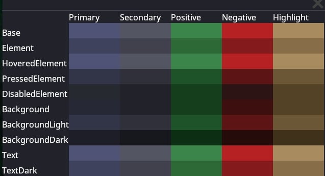
PrimaryPalette: Used for foreground elementsSecondaryPalette: Used for background elementsPositivePalette: A traditionally green palette used to represent success / good / fullNegativePalette: A traditionally red palette used to represent errors / bad / emptyHighlightPalette: Used to highlight headings or important elements
ColorPalette
class. From brightest to darkest, the properties are (as of writing) arranged as
so (where lower numbers are darker):
+0:TextBase-1:TextDark,Element-2:BackgroundLight,PressedElement-3:Background-4:BackgroundDark,DisabledElement
NanotrasenStylesheet’s palette:
ISheetletConfig
ISheetletConfig is intended to cut down on repeated code by providing shared
functionality and definitions between the stylesheets. Any Sheetlet that
requires the values in some instance of ISheetletConfig should have a generic
type constraint that requires the ISheetletConfig interface.
ISheetletConfig also serves as a dependency check. When the stylesheets pull
all the sheetlets that have [CommonSheetlet], they will first check that they
satisfy the type constraint before adding the rules to the stylesheet.
A sheetlet failing to satisfy the type constraints of any stylesheet will cause
the game to log an error. If your styles are not showing up, this may be why.
Resource Access
Resources are accessed different in sheetlets compared to other parts of the codebase. Each stylesheet provides a list of directories (roots) to use when a resource is requested (For example, theTextureResource root in
NanotrasenStylesheet is /Textures/Interface/Nano). This means that any
texture requested with GetTexture will be searched for relative to this
directory.
Generic Sheetlets
Generic sheetlets are used for common UI elements that are used throughout many different UIs. These are grouped together inContent.Client/Stylesheets/Sheetlets. Here are some conventions to follow when
writing generic sheetlets:
- You should always select elements with
.Classand not.Identifier. - When accessing resources, use the
GetTextureOrmethod to get the texture and provide a fallback root to use if the texture is not found within the stylesheets roots. - Avoid manual hardcoding of classes. When referencing classes, you should
only use classes defined on the element being styled (in
StyleClass*properties) or define your own inStyleClass.cs. - If you need to access a resource that is not provided already, you should
add the path to the relevant
ISheetletConfigor create a new one entirely.
Example Code (click to expand)
Example Code (click to expand)
Specific Sheetlets
Specific sheetlets are used in conjunction with UI elements that are used only a few times, most often all in a single UI. These sheetlets are located in the same directory as the*.xaml file they are associated with.
Generally, these sheetlets follow slightly different conventions compared to
generic sheetlets:
- You should prefer to select elements with
.Identifierand not.Class. - Any styles that COULD be used by another UI should be moved to a generic sheetlet.
- Hardcoding is more relaxed, you should still try and avoid it when possible,
but hardcoding
StyleIdentifiers is probably fine. - If you REALLY need a specific resource and its not worth adding it to an
ISheetletConfigyou can access it throughResCacheas normal. - You don’t need to do the generic type constraints thing since the sheetlet should be specific to a single UI, and thus a single stylesheet.
Example Code (click to expand)
Example Code (click to expand)
Making your own Stylesheet
Multiple stylesheets only recently became feasable with the introduction of the
Sheetlet system, so the full range of possibilities this allows has not been
explored. If stylesheets get used in interesting ways besides palette swaps,
please update this section!
SystemStylesheet.
The colors for stylesheets are defined using the
OKLAB color space, a perceptually
uniform color space. When you choose new colors for your stylesheet, it may be
helpful to use an OKLCH Color Picker and modify an existing
color.
Writing C# for UI
TODO: I don’t feel confident enough in my knowledge to describe in detail what to do and what not to do. This is just a general overview for now and should be updated. Also this should probably be another page.The best way to learn how to write UI code is to look at existing code. Some UIs definitely do some terrible things you should never replicate, but there are mountains of terrible code in SS14, so this is not abnormal. I cannot teach familiarity with the internals of this game, but I can give a general overview. Code you could reference:
- Robotics Console
- Reagent Dispenser
- BatteryMenu
MyThing, which we wanted to show a UI for. Heres, generally, what the
structure would look like:
Bound User Interfaces
TODO: someone more familiar with BUIs than me should write about how to write good BUIs. I’ll just stick the notes from#codebase-changesby Bard in the discord here for now:Predicted BUIs are in:For networking data: Option 1 (Preferred). Move the BUI state to component states. Use an existing client system / make one to handle updating the BUI upon the state updating (use TryGetOpenUi) and upon calling Open in the BoundUserInterface. See JukeboxSystem for an example, e.g.Option 2. Have the BUI control be a dummy until the state comes in For UIs: Call TryOpenUi in shared where possible and the client should just handle it. Calling it from server will also still work similar to the old behavior. For messages: Use SendPredictedMessage where possible in BUIs. At some point this will likely become the default over SendMessage. Overall: Prefer to use the overloads that take in EntityUids instead of ICommonSession, this will make it easier to code NPCs who can interact with UIs in future.Some notes for future:
- There’s a helper under
this.CreateWindow<TWindow>()for BUIs that handles disposing + opening + close subscription for you.- There’s a method OnProtoReload that gets called on BUIs so you can override and handle it without having to manually subscribe on another system.
- I have added prototype reload support to some stuff.
- I have cleaned up a lot of BUI code. Windows now just raise events and the BUI itself handles message sending.
- You should spawn / delete control entities inside of EnteredTree and ExitedTree rather than inside Dispose.
- Controls should be able to be constructed with an empty constructor and should not call BUI methods directly. This makes re-use significantly easier.
- All new controls must handle prototype reloading if applicable.
- All new controls should prefer to use component states and not BUI states where possible. These work better with prediction and are easier to use.
- Controls should be able to handle components disappearing and not rely upon
GetComponent<T>everywhere as there are no guarantees the component exists.