> ## Documentation Index
> Fetch the complete documentation index at: https://docs.ss14.art/llms.txt
> Use this file to discover all available pages before exploring further.
# Sprites & Icons
`SpriteComponent` and `IconComponent` are the two primary rendering components for entities. `SpriteComponent` is for rendering of entities on the map, while `IconComponent` is a simpler way to represent an entity's icon in say the spawn panel.
## Texture Selection
There are two ways to select a texture:
1. A direct texture file (right now a PNG).
2. From an RSI, with a state ID. An RSI is our equivalent to BYOND's DMI format, containing a list of icons by key.
Loading from a texture is pretty easy. You just specify a path to a `.png` file in the VFS and you're good.
With an RSI, you need to specify the RSI itself in one variable, then the RSI state in another.
### `IconComponent`
`IconComponent` has 3 properties in a prototype:
```yml theme={null}
- type: Icon
texture: ""
sprite: ""
state: ""
```
`texture` is used to refer to a direct texture such as a PNG. `sprite` and `state` are used to refer to an RSI and the relevant state for it, respectively. These are mutually exclusive: you cannot use `texture` together with `sprite` and `state`.
.
### `SpriteComponent`
Ah this is where it gets fun. `SpriteComponent` does everything, shader support, layers, directions, animations...
The component uses multiple layers, sorta like overlays in BYOND. These layers are drawn in order, meaning that the last layer in the list will be on top.
You can specify layers in a prototype as a list under the `layers` key, so like this:
```yml theme={null}
- type: Sprite
layers:
- texture: "a.png"
- texture: "b.png"
- ...
```
A layer in a prototype has the following properties:
* `texture`: same as for the `IconComponent`.
* `sprite`: same as for `IconComponent`. If this is not specified, a layer can fall back to the `sprite` property of the main prototype (more on this below).
* `state`: same as for `IconComponent`: the RSI state to use.
* `shader`: this is where it gets fun: the ID of a shader to use. [See here for documentation on shaders](./shaders).
* `scale`: Scale applied to the layer, as a vector 2 (2 floats separated by comma).
* `rotation`: Rotation applied to the layer, in degrees.
* `visible`: `true` or `false`, enables/disables the layer. This is useful if the layer gets re-enabled by code, such as the flame of a welding tool.
The main prototype also has some properties:
* `sprite`, `state` and `texture`. These function as quick short hands for the same properties on layers. If these are set, a layer is added with these as texture parameters. One thing to note is that **`sprite` functions for all layers, unless the layer specifies one itself.** So you can set the base sprite of the prototype to an RSI, and then each layer only needs a state specified.
* `scale`: scale applied to every layer.
* `rotation`: rotation applied to every layer, in degrees.
* `offset`: amount to offset every layer with.
* `drawdepth`: draw ordering of this sprite. This maps to the `DrawDepth` enum in code. Higher means the object will render above objects with a lower draw depth always.
* `color`: color multiplication applied to every layer. Use a hex color.
* `directional`: if true, the sprite will not rotate with the entity, but will change RSI direction to north/south/east/west or whatever. If false, these directions will be ignored and the sprite will rotate as normal. Disabling this is useful for top-down sprites that should rotate such as bullets.
* `visible`: makes the entire component visible or not.
All these properties can be changed at runtime with methods on the component.
***
# Sprite Art Guide
This guide covers the visual side of creating sprites for Space Station 14. These are recommendations, not strict rules — use them as a starting point and develop your own style with practice.
## Visual Style
SS14 uses a **3/4 top-down projection** — you see the top face and one side of each object. The light source is typically above and slightly to one side.
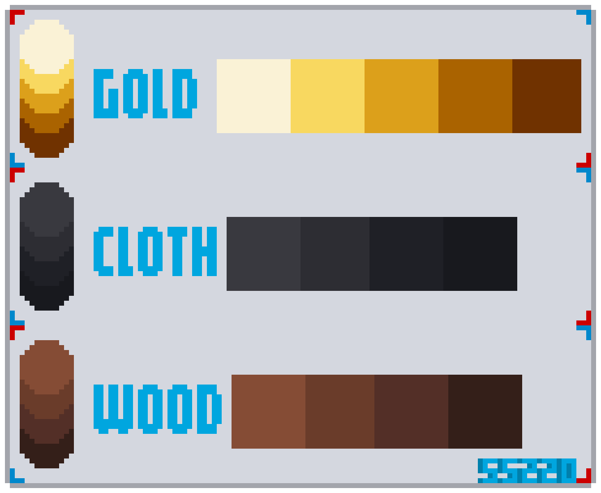
### Palette
Use a limited palette of **4–5 shades per base color**:
| Shade | Purpose |
| ---------- | ----------------------------------------- |
| Highlight | Brightest point, used for glossy surfaces |
| Light | Lit area facing the light source |
| Base | The main color of the material |
| Mid-shadow | Transition between base and shadow |
| Shadow | Darkest area, opposite the light source |
A good rule of thumb: make shadows slightly **cooler** (bluish) and highlights slightly **warmer** (yellowish). This is called hue shifting and makes colors feel more natural.
 ### Contour (Outline)
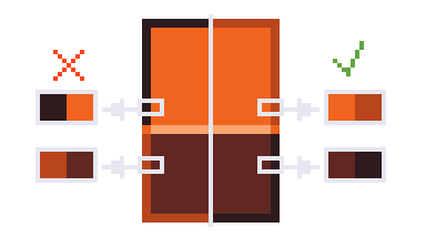
* Every sprite needs an **outline** — it separates the object from the background.
* **Never use pure black outlines**. Use a darker shade of the object's own color instead.
* Vary the outline color slightly along the shadow side for a softer look.
### Contour (Outline)
* Every sprite needs an **outline** — it separates the object from the background.
* **Never use pure black outlines**. Use a darker shade of the object's own color instead.
* Vary the outline color slightly along the shadow side for a softer look.
 ### Contrast
Make sure light and shadow are clearly different. Low contrast makes sprites look flat and hard to read at a distance. If in doubt, zoom out — if details blend together, increase contrast.
## Theory
### Line Art
Start with clean lines before adding color. Key points:
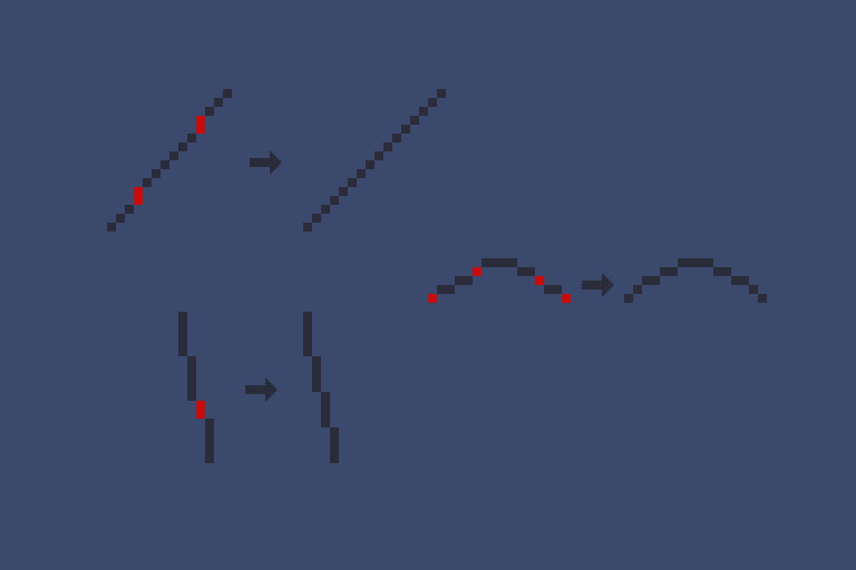
* Keep line thickness **consistent** throughout the sprite.
* Avoid **jagged edges** — diagonal lines should use a smooth, repeating pixel pattern.
### Contrast
Make sure light and shadow are clearly different. Low contrast makes sprites look flat and hard to read at a distance. If in doubt, zoom out — if details blend together, increase contrast.
## Theory
### Line Art
Start with clean lines before adding color. Key points:
* Keep line thickness **consistent** throughout the sprite.
* Avoid **jagged edges** — diagonal lines should use a smooth, repeating pixel pattern.
 ### Anti-Aliasing
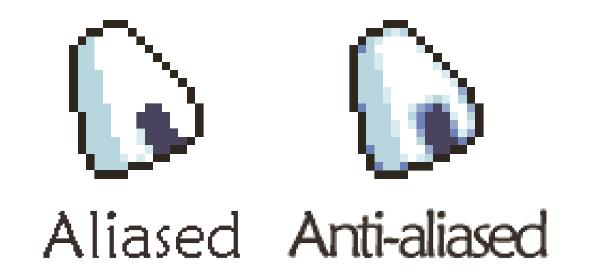
Anti-aliasing (AA) softens harsh pixel edges by placing intermediate-color pixels at corners and curves. Use it sparingly — too much makes sprites blurry.
### Anti-Aliasing
Anti-aliasing (AA) softens harsh pixel edges by placing intermediate-color pixels at corners and curves. Use it sparingly — too much makes sprites blurry.
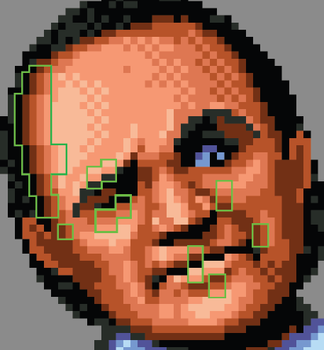
 Avoid **banding** — parallel lines of similar color that create a striped effect. Banding makes shadows look mechanical. If you're not sure, keep it simple and clean.
 ### Shading by Material
Different materials reflect light differently:
| Material | Shading Style |
| -------- | ----------------------------------------------------------- |
| Metal | Strong highlights, high contrast, sharp transitions |
| Plastic | Medium contrast, softer highlights |
| Fabric | Diffuse light, soft shadows, no highlights, matte |
| Wood | Matte (raw) or glossy (varnished), often with grain texture |
| Glass | Semitransparent, strong edge highlights |
Always define your **light source first** before shading. In SS14, light comes from above.
### Shading by Material
Different materials reflect light differently:
| Material | Shading Style |
| -------- | ----------------------------------------------------------- |
| Metal | Strong highlights, high contrast, sharp transitions |
| Plastic | Medium contrast, softer highlights |
| Fabric | Diffuse light, soft shadows, no highlights, matte |
| Wood | Matte (raw) or glossy (varnished), often with grain texture |
| Glass | Semitransparent, strong edge highlights |
Always define your **light source first** before shading. In SS14, light comes from above.
 ### Axonometry (3/4 Perspective)
Objects are drawn in a 3/4 top-down projection. The 3/4 edge (where the top face meets the side face) is usually highlighted to make the form readable.
Start with **primitive shapes** (cube, cylinder, sphere) to block out volume. Build the object like a construction kit, check the silhouette, then add color and shading.
### Axonometry (3/4 Perspective)
Objects are drawn in a 3/4 top-down projection. The 3/4 edge (where the top face meets the side face) is usually highlighted to make the form readable.
Start with **primitive shapes** (cube, cylinder, sphere) to block out volume. Build the object like a construction kit, check the silhouette, then add color and shading.
 ### Common Mistakes
* **Pillow shading** — shading evenly from center to edges without a light source. Always pick a light direction first.
* **Over-dithering** — too much pixel noise hides the form. Use dithering sparingly for texture only.
* **Too many colors** — stick to 4–5 per base color; more shades rarely improve a 32×32 sprite.
## Software
### Aseprite (Recommended)
Aseprite is the most popular pixel art editor. It's specialized, lightweight, and great for animation.
**Basic tools:**
| Tool | Key | Use |
| ------------ | --- | ---------------------------- |
| Pencil | B | Draw individual pixels |
| Eraser | E | Remove pixels |
| Eyedropper | I | Pick a color from the canvas |
| Paint Bucket | G | Fill an area with one color |
| Selection | M | Select/move/copy areas |
| Line | L | Draw straight lines |
**Useful shortcuts:**
* `Shift + R` — replace one color with another
* `Shift + H` — flip horizontally
* `Shift + V` — flip vertically
* `Shift + O` — auto-outline selection
**Animation:** Press `Tab` to open the timeline. Layers work like transparent sheets. `Shift + N` for new layer, `Alt + N` for new frame.
**Scripts:** Aseprite supports Lua scripts (File → Scripts → Open Scripts Folder). The More Color Shading Options script helps generate palettes.
### Resprite (Mobile)
Free Aseprite-like editor for phones. Useful for quick sketches and practice on the go.
## Practice
### Approach 1: Template-Based
Use existing sprite templates (SS220 has a large collection). Replace the palette while keeping the structure:
1. Load a template.
2. Replace each shade with your chosen colors.
3. Adjust brightness/saturation to fit the game's style.
This approach is great for learning palette work and clothing structure.
### Approach 2: From Scratch
Start with a simple object (e.g., a wooden chair) to practice the full pipeline:
1. **Silhouette** — block out the basic shape. Define the light source.
2. **Volume** — add details (legs, seat, backrest) in the right perspective.
3. **Shadows & Outlines** — darken areas away from the light. Add colored outlines.
4. **Edge transitions** — highlight the 3/4 edge between faces.
5. **Drop shadow** — add a shadow on the ground matching the light direction.
Build up from simple shapes. Even complex objects can be broken into cubes, cylinders, and spheres.
## Working with RSI
For technical details on the RSI format (meta.json, state naming, licensing), see the [RSI specification](./sprites-and-icons#texture-selection) above. Key naming conventions:
* RSI folder names: lowercase, underscore-separated, no prefixes like `_ss220`
* Sprite files inside: `icon.png` (32×32 inventory), `equipped-INNERCLOTHING.png` (64×64, 4 dirs), `inhand-left.png` / `inhand-right.png`
* `meta.json` must include: version, license, copyright, size, and states array
## Resources
* [Pixel Logic — Michael Azzi](https://gumroad.com/l/pixel_logic) (recommended reading)
* [Aseprite](https://aseprite.org/) — pixel art editor
* [Space Background Generator](https://deep-fold.itch.io/space-background-generator) — for parallax backgrounds
* SS220/Sunrise spriting guides (source of this condensed guide)
### Common Mistakes
* **Pillow shading** — shading evenly from center to edges without a light source. Always pick a light direction first.
* **Over-dithering** — too much pixel noise hides the form. Use dithering sparingly for texture only.
* **Too many colors** — stick to 4–5 per base color; more shades rarely improve a 32×32 sprite.
## Software
### Aseprite (Recommended)
Aseprite is the most popular pixel art editor. It's specialized, lightweight, and great for animation.
**Basic tools:**
| Tool | Key | Use |
| ------------ | --- | ---------------------------- |
| Pencil | B | Draw individual pixels |
| Eraser | E | Remove pixels |
| Eyedropper | I | Pick a color from the canvas |
| Paint Bucket | G | Fill an area with one color |
| Selection | M | Select/move/copy areas |
| Line | L | Draw straight lines |
**Useful shortcuts:**
* `Shift + R` — replace one color with another
* `Shift + H` — flip horizontally
* `Shift + V` — flip vertically
* `Shift + O` — auto-outline selection
**Animation:** Press `Tab` to open the timeline. Layers work like transparent sheets. `Shift + N` for new layer, `Alt + N` for new frame.
**Scripts:** Aseprite supports Lua scripts (File → Scripts → Open Scripts Folder). The More Color Shading Options script helps generate palettes.
### Resprite (Mobile)
Free Aseprite-like editor for phones. Useful for quick sketches and practice on the go.
## Practice
### Approach 1: Template-Based
Use existing sprite templates (SS220 has a large collection). Replace the palette while keeping the structure:
1. Load a template.
2. Replace each shade with your chosen colors.
3. Adjust brightness/saturation to fit the game's style.
This approach is great for learning palette work and clothing structure.
### Approach 2: From Scratch
Start with a simple object (e.g., a wooden chair) to practice the full pipeline:
1. **Silhouette** — block out the basic shape. Define the light source.
2. **Volume** — add details (legs, seat, backrest) in the right perspective.
3. **Shadows & Outlines** — darken areas away from the light. Add colored outlines.
4. **Edge transitions** — highlight the 3/4 edge between faces.
5. **Drop shadow** — add a shadow on the ground matching the light direction.
Build up from simple shapes. Even complex objects can be broken into cubes, cylinders, and spheres.
## Working with RSI
For technical details on the RSI format (meta.json, state naming, licensing), see the [RSI specification](./sprites-and-icons#texture-selection) above. Key naming conventions:
* RSI folder names: lowercase, underscore-separated, no prefixes like `_ss220`
* Sprite files inside: `icon.png` (32×32 inventory), `equipped-INNERCLOTHING.png` (64×64, 4 dirs), `inhand-left.png` / `inhand-right.png`
* `meta.json` must include: version, license, copyright, size, and states array
## Resources
* [Pixel Logic — Michael Azzi](https://gumroad.com/l/pixel_logic) (recommended reading)
* [Aseprite](https://aseprite.org/) — pixel art editor
* [Space Background Generator](https://deep-fold.itch.io/space-background-generator) — for parallax backgrounds
* SS220/Sunrise spriting guides (source of this condensed guide)